Kirklees Markets
A Proposed Identity for a Community That Refuses to Be Homogenised
Redefining a public market system is not about competing with corporations on polish. It is about standing apart from them with conviction. This proposed identity for Kirklees Markets was developed as a strategic reimagining of how local markets could present themselves as bold, unified, and proudly human destinations. The work explores how multiple town markets could operate independently while standing together as a recognisable collective rooted in community, heritage, and everyday life.

Standing Tall Against the Giants
This proposal set out to challenge the visual sameness of corporate retail by creating a confident, community-led identity for Kirklees Markets. The brief was to design a system that could work across multiple towns, each with its own character, while still standing together as a unified collective. The goal was not to out-polish big brands, but to out-human them, repositioning the markets as bold, family-friendly destinations rather than inherited public services.

Where Local Stories Get Their Hands Dirty
At the heart of the proposal was a simple principle: markets thrive when people are at the centre. The identity was designed to feel warm, approachable, and confident, celebrating traders, customers, and everyday interactions. The aim was to position each market as a vibrant social hub, a place where the community gathers, rather than just a space to shop.


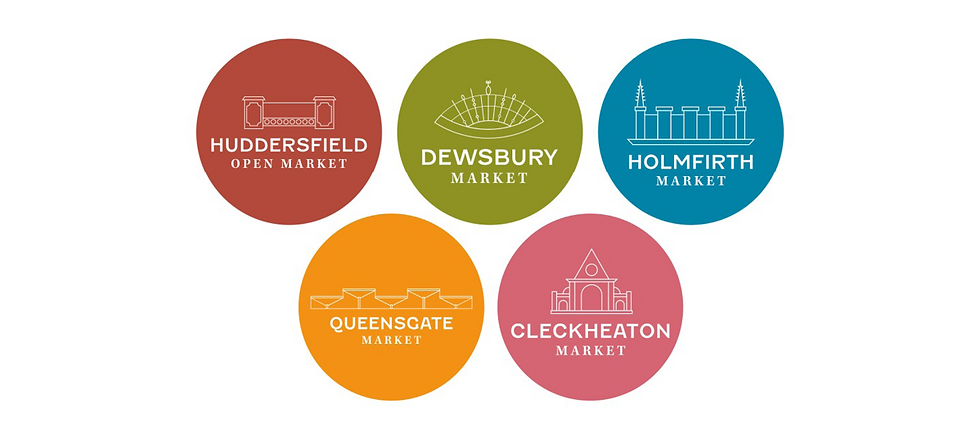
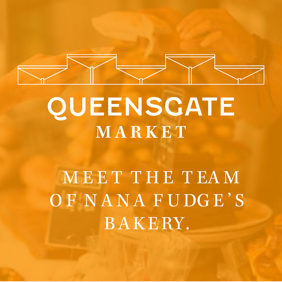
Built From the Towns Themselves
Rather than relying on generic symbols, the visual system was rooted in local architectural history. Each icon was custom designed using recognisable landmarks from across Kirklees, including gateways, clock towers, and distinctive rooflines. These formed a flexible icon set that allowed each market to retain its own sense of place while clearly belonging to the wider Kirklees Markets family. The typography balanced heritage and clarity, ensuring the identity felt established without becoming old-fashioned.
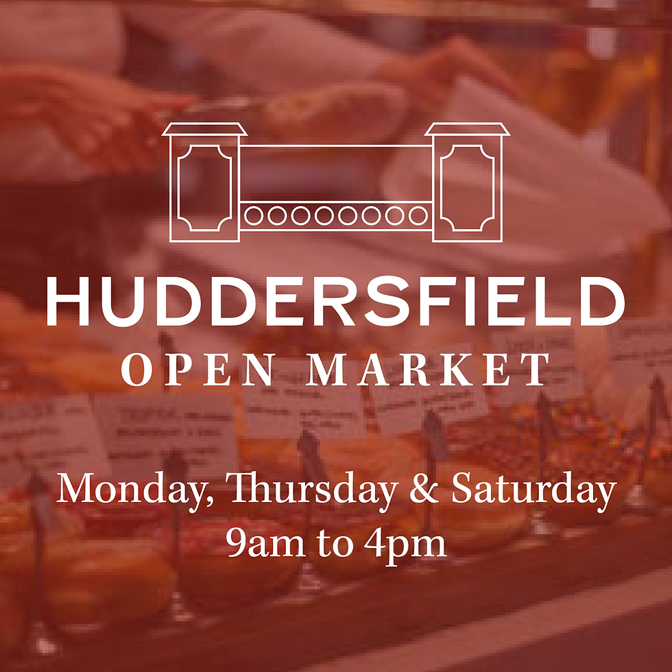
A System Designed to Travel
This was never intended to be a static logo. The proposal outlined a scalable visual language designed to perform across banners, signage, printed materials, and mobile-first social media. Semi-transparent colour panels allowed real imagery of fresh produce and people to take centre stage, while maintaining strong brand recognition at distance and at speed. The system was built to flex across environments without losing coherence.


Strategy Lives in the Real World
Every touchpoint was interrogated through the lens of real use. Signage was designed to be legible for drivers, pedestrians, and families moving through busy town centres. Printed materials were repositioned as storytelling tools rather than sales assets, giving space to vendor stories and community narratives. The proposal prioritised clarity, empathy, and trust over decorative excess.

From Identity to Activation
The proposal extended beyond visuals into how the brand could live on the ground. Suggested initiatives included meet-the-vendor events, wellbeing workshops, and opportunities for first-time traders to run their own stalls. These ideas were designed to help the identity earn its place in the community, reinforcing the markets as social spaces as much as commercial ones.
A Brand Built to Belong
This proposed identity demonstrates how public-sector branding can be confident without being corporate, and expressive without losing trust. By stripping away visual noise and amplifying what already mattered, the work reimagined Kirklees Markets as a resilient, community-first brand designed to endure rather than shout.


Let's build something together.
We love turning ideas into something real. Whatever you’re imagining, we’re here to help it take shape. With purpose, creativity, and a little bit of boldness.
Fill in in the form or email hello@studioironoak.co.uk