High Seat Ltd.
Exploring a Contemporary Repositioning for a Heritage Brand
This project was developed as a strategic rebrand proposal and presented to the High Seat Ltd. board. While the direction was not taken through to full rollout, it demonstrates a considered approach to evolving a heritage brand for a modern audience.
Reclaiming Confidence
High Seat Ltd. sits within a rare position: a nationally recognised brand with decades of trust behind it, but one increasingly constrained by perception. The challenge was not simply visual renewal, but repositioning. Exploring how the brand could evolve beyond a narrow demographic label and reconnect with customers who are younger in outlook, digitally fluent, and design-aware.
A key strategic proposal was to move away from the abbreviated HSL and confidently reintroduce High Seat Ltd. in full, allowing the brand’s heritage to lead rather than hide.

Designing for the “Young at Heart”
Research highlighted a consistent theme: customers within the 55–65+ bracket do not identify with “age-based” marketing. They value independence, quality, and longevity, and respond poorly to language or aesthetics that feel clinical or overly cautious.
The proposed direction focused on building a brand that felt energetic, capable, and assured. Reflecting the mindset of the audience rather than stereotypes associated with the category.


Keeping What Matters, Removing What Doesn’t
Rather than starting from scratch, the proposal centred on a disciplined edit of the existing identity. Decorative elements that lacked meaning or constrained flexibility were removed, allowing the brand to breathe and adapt across modern touchpoints.
The serif logotype: a long-standing signal of trust and heritage was retained, while a contemporary sans-serif was introduced for supporting typography. This pairing was designed to bridge generations: respectful of history, but clear and legible in digital environments.

Colour with Conviction
The existing colour palette leaned heavily toward safety and neutrality, reinforcing associations with medical necessity rather than personal choice. The proposed system introduced deeper, more confident tones, shifting the brand’s expression toward strength, reassurance, and premium quality.
This palette was designed to work fluidly across print, retail environments, and digital media, without reliance on rigid containers or visual constraints.


Built for Flexibility, Not Fashion
Every decision within the proposal was tested against practical and strategic considerations, from legibility at distance to performance on mobile devices. Removing the boxed logo structure increased adaptability, while typographic choices balanced authority with approachability.
The result was a system intended to scale across signage, advertising, and interface design without losing clarity or character.

Letting Craft Do the Talking
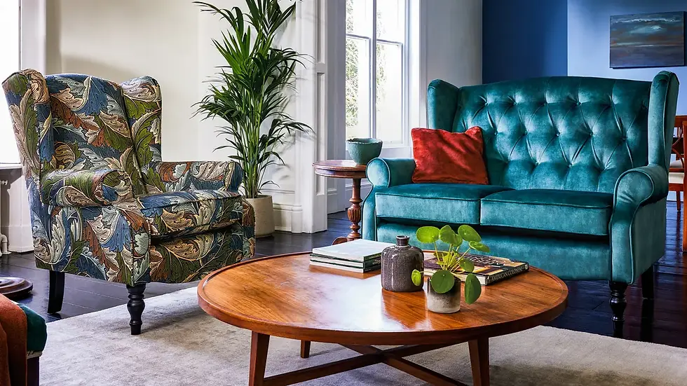
To demonstrate the repositioning in context, the proposal was applied across premium mock-ups. Retail clutter and promotional noise were intentionally reduced, allowing materials, textures, and product craftsmanship to lead.
Digital concepts explored cleaner layouts, confident headlines, and subtle brand storytelling, shifting the tone from transactional retail to considered lifestyle positioning.


A Considered Direction for a Heritage Brand
This proposal explored how High Seat Ltd. could evolve its visual identity without abandoning the trust it has built over decades. While the direction was not adopted, the project stands as an example of strategic restraint. Showing how heritage brands can modernise through clarity, confidence, and thoughtful subtraction rather than reinvention.


Let's build something together.
We love turning ideas into something real. Whatever you’re imagining, we’re here to help it take shape. With purpose, creativity, and a little bit of boldness.
Fill in in the form or email hello@studioironoak.co.uk